Redesigned to reduce user drop-offs
in booking flow
Redesigned to reduce user drop-offs in booking flow
Redesigned to reduce user drop-offs in booking flow
My role
Product Designer
My role
Product Designer
My role
Product Designer
Team
1 Product Designer (me)
1 Frontend Developer
1 Product Owner
Team
1 Product Designer (me)
1 Frontend Developer
1 Product Owner
Team
1 Product Designer (me)
1 Frontend Developer
1 Product Owner
Timeline
2 weeks
September 2024
Timeline
2 weeks
September 2024
Timeline
2 weeks
September 2024
BACKGROUND
The PSC app launched quickly to meet demand, however, the original version suffered from cluttered screens, hidden primary actions, and poor accessibility. Users were getting lost and dropping off at every step, unable to complete their queue booking.
BACKGROUND
The PSC app launched quickly to meet demand, however, the original version suffered from cluttered screens, hidden primary actions, and poor accessibility. Users were getting lost and dropping off at every step, unable to complete their queue booking.
BACKGROUND
The PSC app launched quickly to meet demand, however, the original version suffered from cluttered screens, hidden primary actions, and poor accessibility. Users were getting lost and dropping off at every step, unable to complete their queue booking.
IMPACT
Transformed a chaotic government booking flow into a calm, accessible and usable experience in just 2 weeks with zero budget.
IMPACT
Transformed a chaotic government booking flow into a calm, accessible and usable experience in just 2 weeks with zero budget.
IMPACT
Transformed a chaotic government booking flow into a calm, accessible and usable experience in just 2 weeks with zero budget.
~25%
~25%
~25%
estimated drop-off reduction. Based on guerrilla testing & heuristic benchmarks
estimated drop-off reduction. Based on guerrilla testing & heuristic benchmarks
estimated drop-off reduction. Based on guerrilla testing & heuristic benchmarks
40%
40%
40%
fewer actions. Booking flow reduced from 5 steps to 3
fewer actions. Booking flow reduced from 5 steps to 3
fewer actions. Booking flow reduced from 5 steps to 3
100%
100%
100%
of screens WCAG 2.1 AA compliant. All body & large text reaches AAA contrast ratios
of screens WCAG 2.1 AA compliant. All body & large text reaches AAA contrast ratios
of screens WCAG 2.1 AA compliant. All body & large text reaches AAA contrast ratios


OVERVIEW
What is PSC?
PSС (Public Service Centre) is a one-stop shop where citizens access government services such as IDs, passports, permits, etc. The app is designed to streamline queue bookings and provides other essential services for Kazakhstani residents.
OVERVIEW
What is PSC?
PSС (Public Service Centre) is a one-stop shop where citizens access government services such as IDs, passports, permits, etc. The app is designed to streamline queue bookings and provides other essential services for Kazakhstani residents.
OVERVIEW
What is PSC?
PSС (Public Service Centre) is a one-stop shop where citizens access government services such as IDs, passports, permits, etc. The app is designed to streamline queue bookings and provides other essential services for Kazakhstani residents.


PROBLEM
No UX, no compassion
When I joined the team, the PSC app had been built by developers under extreme time pressure. There was no dedicated designer - and it showed.
Worst of all, the app failed at its core promise: front-office managers were still surrounded by people asking for help and were forced to guide them through every screen by hand. Instead of reducing queues, the app had become another source of frustration.
That’s when I stepped in to turn chaos into calm.
PROBLEM
No UX, no compassion
When I joined the team, the PSC app had been built by developers under extreme time pressure. There was no dedicated designer - and it showed.
Worst of all, the app failed at its core promise: front-office managers were still surrounded by people asking for help and were forced to guide them through every screen by hand. Instead of reducing queues, the app had become another source of frustration.
That’s when I stepped in to turn chaos into calm.
PROBLEM
No UX, no compassion
When I joined the team, the PSC app had been built by developers under extreme time pressure. There was no dedicated designer - and it showed.
Worst of all, the app failed at its core promise: front-office managers were still surrounded by people asking for help and were forced to guide them through every screen by hand. Instead of reducing queues, the app had become another source of frustration.
That’s when I stepped in to turn chaos into calm.
RESEARCH
Understanding users' pain points
First of all, with no budget for in-depth research and only 2 weeks to redesign the PSС app’s flow, I adopted a Lean UX approach to efficiently uncover user pain points.
To better understand the current problems, I conducted a quick heuristic evaluation of the existing booking experience, identifying potential friction points.
To gain real insights, I spoke with the Head of the Front Office - a key stakeholder who observes user struggles daily. This concise yet insightful conversation confirmed my hypotheses and uncovered additional user challenges.
RESEARCH
Understanding users' pain points
First of all, with no budget for in-depth research and only 2 weeks to redesign the PSС app’s flow, I adopted a Lean UX approach to efficiently uncover user pain points.
To better understand the current problems, I conducted a quick heuristic evaluation of the existing booking experience, identifying potential friction points.
To gain real insights, I spoke with the Head of the Front Office - a key stakeholder who observes user struggles daily. This concise yet insightful conversation confirmed my hypotheses and uncovered additional user challenges.
RESEARCH
Understanding users' pain points
First of all, with no budget for in-depth research and only 2 weeks to redesign the PSС app’s flow, I adopted a Lean UX approach to efficiently uncover user pain points.
To better understand the current problems, I conducted a quick heuristic evaluation of the existing booking experience, identifying potential friction points.
To gain real insights, I spoke with the Head of the Front Office - a key stakeholder who observes user struggles daily. This concise yet insightful conversation confirmed my hypotheses and uncovered additional user challenges.
Outdated design
Inconsistent styling, visual clutter, and poor spacing made it harder to focus on key actions. The colour palette failed to meet accessibility standards (WCAG), which significantly impacted readability.
Inconsistent styling, visual clutter, and poor spacing made it harder to focus on key actions. The colour palette failed to meet accessibility standards (WCAG), which significantly impacted readability.
Inconsistent styling, visual clutter, and poor spacing made it harder to focus on key actions. The colour palette failed to meet accessibility standards (WCAG), which significantly impacted readability.
Services aren’t clear to regular users
People without prior experience using government services struggle to understand the meaning of labels, which leads many users to reach out to the front office staff for extra help.
People without prior experience using government services struggle to understand the meaning of labels, which leads many users to reach out to the front office staff for extra help.
People without prior experience using government services struggle to understand the meaning of labels, which leads many users to reach out to the front office staff for extra help.
Unclear user flow
In most UX-driven platforms, booking flows are broken down into 3 clear steps, often supported by a progress indicator to guide the user. In contrast, the PSC app lacks both, making the flow feel long and hard to follow.
In most UX-driven platforms, booking flows are broken down into 3 clear steps, often supported by a progress indicator to guide the user. In contrast, the PSC app lacks both, making the flow feel long and hard to follow.
In most UX-driven platforms, booking flows are broken down into 3 clear steps, often supported by a progress indicator to guide the user. In contrast, the PSC app lacks both, making the flow feel long and hard to follow.
RESEARCH
Competitive analysis
Furthermore, to better understand how user-friendly apps structure their flows and get some ideas to solve problems, I reviewed different systems and analyzed best practices across both public and private services, including government platforms, and e-commerce tools.
My goal was to identify design patterns that reduce cognitive load and support a smoother, more intuitive user experience.
RESEARCH
Competitive analysis
Furthermore, to better understand how user-friendly apps structure their flows and get some ideas to solve problems, I reviewed different systems and analyzed best practices across both public and private services, including government platforms, and e-commerce tools.
My goal was to identify design patterns that reduce cognitive load and support a smoother, more intuitive user experience.
RESEARCH
Competitive analysis
Furthermore, to better understand how user-friendly apps structure their flows and get some ideas to solve problems, I reviewed different systems and analyzed best practices across both public and private services, including government platforms, and e-commerce tools.
My goal was to identify design patterns that reduce cognitive load and support a smoother, more intuitive user experience.


Clear Mains action
Well-designed and popular platforms in Kazakhstan, such as Yandex and Airbnb, place their Main actions in prominent areas of the screen (search, services). This helps users quickly identify where to go and what to do.
Well-designed and popular platforms in Kazakhstan, such as Yandex and Airbnb, place their Main actions in prominent areas of the screen (search, services). This helps users quickly identify where to go and what to do.
Well-designed and popular platforms in Kazakhstan, such as Yandex and Airbnb, place their Main actions in prominent areas of the screen (search, services). This helps users quickly identify where to go and what to do.

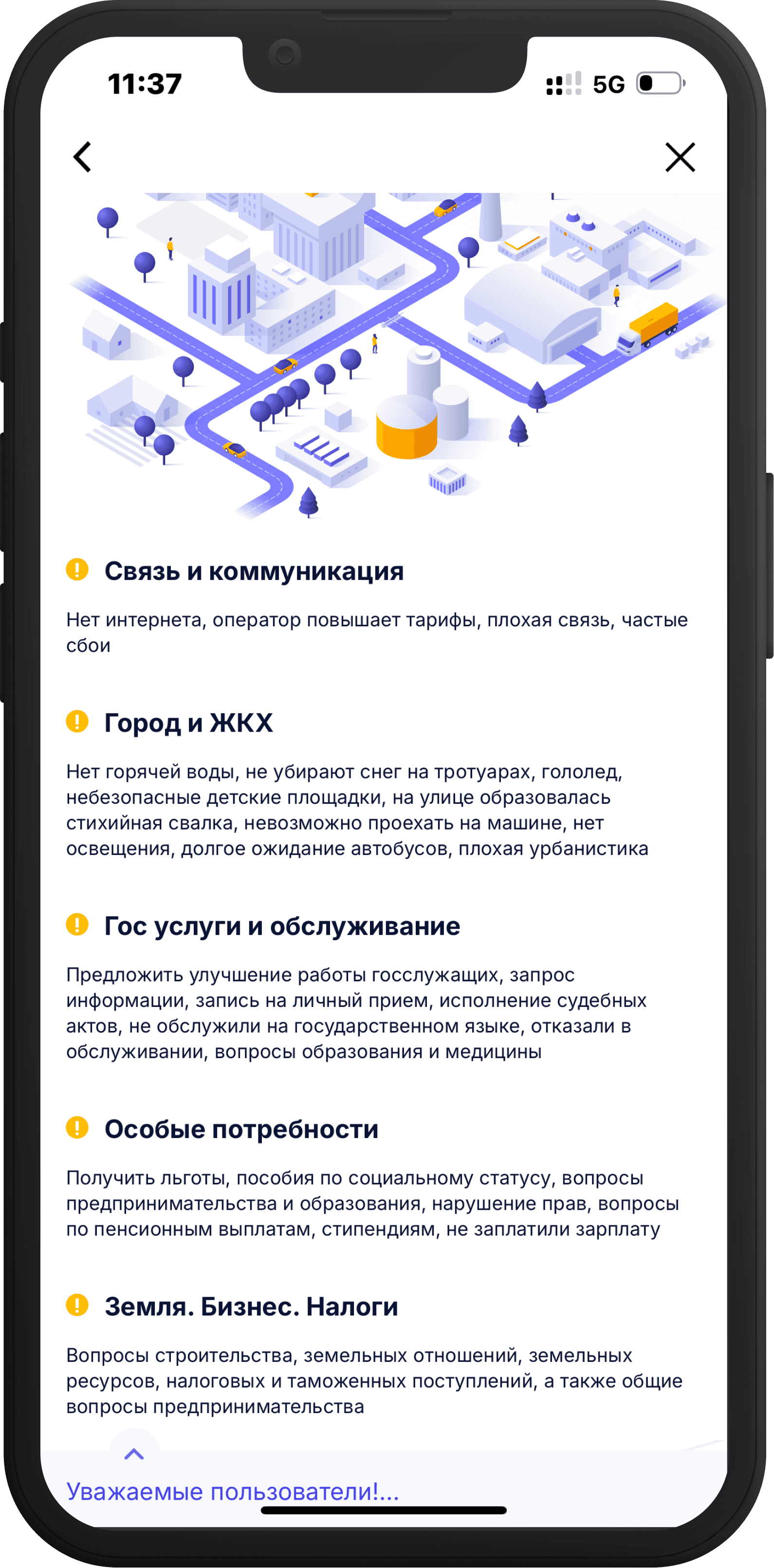
Clarity of terms
To ensure users understand labels and actions, apps like Uber and egov.kz (another electronic government service in KZ) provide short, supportive descriptions under labels. This hint text improves clarity, especially for new or unfamiliar terms.
To ensure users understand labels and actions, apps like Uber and egov.kz (another electronic government service in KZ) provide short, supportive descriptions under labels. This hint text improves clarity, especially for new or unfamiliar terms.
To ensure users understand labels and actions, apps like Uber and egov.kz (another electronic government service in KZ) provide short, supportive descriptions under labels. This hint text improves clarity, especially for new or unfamiliar terms.


Guide users
Linear flows, such as sign-up or checkout processes in IKEA and TheDesignDesk apps, usually follow 3 clear steps with a progress bar to show users their current position and remaining tasks, helping reduce cognitive overload.
Linear flows, such as sign-up or checkout processes in IKEA and TheDesignDesk apps, usually follow 3 clear steps with a progress bar to show users their current position and remaining tasks, helping reduce cognitive overload.
Linear flows, such as sign-up or checkout processes in IKEA and TheDesignDesk apps, usually follow 3 clear steps with a progress bar to show users their current position and remaining tasks, helping reduce cognitive overload.
DISCOVERY
Understanding the job
After gaining all necessary information I needed to translate all these pain points into something actionable. That's when I crafted a job story, a simple framework that would keep me focused on the user's real needs rather than getting lost in feature requests.
DISCOVERY
Understanding the job
After gaining all necessary information I needed to translate all these pain points into something actionable. That's when I crafted a job story, a simple framework that would keep me focused on the user's real needs rather than getting lost in feature requests.
DISCOVERY
Understanding the job
After gaining all necessary information I needed to translate all these pain points into something actionable. That's when I crafted a job story, a simple framework that would keep me focused on the user's real needs rather than getting lost in feature requests.
When
When
When
I need to book a queue at the PSC to get a specific service
I need to book a queue at the PSC to get a specific service
I need to book a queue at the PSC to get a specific service
I want to
I want to
I want to
understand the service categories and booking steps
understand the service categories and booking steps
understand the service categories and booking steps
So
So
So
I don’t feel lost, waste time, or rely on others
I don’t feel lost, waste time, or rely on others
I don’t feel lost, waste time, or rely on others
DESIGN SOLUTION
Home screen redesign
To enhance the booking flow experience, I redesigned the main screen, which lacked clarity for first-time users. To achieve this, I:
Added illustrations for better scanning
Refined the label "Get a Ticket" button to be clearer and more descriptive, while adding an icon for better visibility and instant recognition
Created helpful tips specifically designed for first-time users to reduce their dependency on staff assistance
As such, I improved the entire layout with better spacing, simplified navigation, and a cleaner visual hierarchy. The green accent colour aligns with the organization's recent rebranding, creating a more cohesive and professional appearance.
DESIGN SOLUTION
Home screen redesign
To enhance the booking flow experience, I redesigned the main screen, which lacked clarity for first-time users. To achieve this, I:
Added illustrations for better scanning
Refined the label "Get a Ticket" button to be clearer and more descriptive, while adding an icon for better visibility and instant recognition
Created helpful tips specifically designed for first-time users to reduce their dependency on staff assistance
As such, I improved the entire layout with better spacing, simplified navigation, and a cleaner visual hierarchy. The green accent colour aligns with the organization's recent rebranding, creating a more cohesive and professional appearance.
DESIGN SOLUTION
Home screen redesign
To enhance the booking flow experience, I redesigned the main screen, which lacked clarity for first-time users. To achieve this, I:
Added illustrations for better scanning
Refined the label "Get a Ticket" button to be clearer and more descriptive, while adding an icon for better visibility and instant recognition
Created helpful tips specifically designed for first-time users to reduce their dependency on staff assistance
As such, I improved the entire layout with better spacing, simplified navigation, and a cleaner visual hierarchy. The green accent colour aligns with the organization's recent rebranding, creating a more cohesive and professional appearance.

1
1
1
2
2
2
3
3
3
BEFORE
AFTER
DESIGN SOLUTION
Simplifying booking flow
The original booking flow split city and branch selection across two separate screens, creating a disjointed experience that confused users about their progress. To solve this I:
Added a clear progress bar to help users understand where they are in the booking process and what steps remain
Consolidated city and district selection into a single, intuitive screen
By working closely with the frontend engineer, we implemented automatic city detection to speed up the process for most users, while maintaining manual selection options for those who need flexibility or are booking for different locations.
DESIGN SOLUTION
Simplifying booking flow
The original booking flow split city and branch selection across two separate screens, creating a disjointed experience that confused users about their progress. To solve this I:
Added a clear progress bar to help users understand where they are in the booking process and what steps remain
Consolidated city and district selection into a single, intuitive screen
By working closely with the frontend engineer, we implemented automatic city detection to speed up the process for most users, while maintaining manual selection options for those who need flexibility or are booking for different locations.
DESIGN SOLUTION
Simplifying booking flow
The original booking flow split city and branch selection across two separate screens, creating a disjointed experience that confused users about their progress. To solve this I:
Added a clear progress bar to help users understand where they are in the booking process and what steps remain
Consolidated city and district selection into a single, intuitive screen
By working closely with the frontend engineer, we implemented automatic city detection to speed up the process for most users, while maintaining manual selection options for those who need flexibility or are booking for different locations.
1
1
1
2
2
2
BEFORE
AFTER
DESIGN SOLUTION
Adding descriptions and error prevention
Earlier usability issues also revealed that the names of service types were confusing to regular users. To address this, I:
Added brief descriptions to each category and used a more consistent, accessible layout
In order to reduce errors, the “Continue” button remains inactive until a service type is selected, helping users stay on track.
DESIGN SOLUTION
Adding descriptions and error prevention
Earlier usability issues also revealed that the names of service types were confusing to regular users. To address this, I:
Added brief descriptions to each category and used a more consistent, accessible layout
In order to reduce errors, the “Continue” button remains inactive until a service type is selected, helping users stay on track.
DESIGN SOLUTION
Adding descriptions and error prevention
Earlier usability issues also revealed that the names of service types were confusing to regular users. To address this, I:
Added brief descriptions to each category and used a more consistent, accessible layout
In order to reduce errors, the “Continue” button remains inactive until a service type is selected, helping users stay on track.

1
1
1
BEFORE
AFTER
DESIGN SOLUTION
Fixing broken flow
The next problem appeared on the “Confirm Booking” screen. After choosing a service, users were unexpectedly directed to a page where they had to manually tap “Choose date and time.” This broke the flow and was unclear, so I:
Prioritized the nearest available options as the default while keeping all other dates accessible. And replaced this step with a new screen that directly shows available dates and times
DESIGN SOLUTION
Fixing broken flow
The next problem appeared on the “Confirm Booking” screen. After choosing a service, users were unexpectedly directed to a page where they had to manually tap “Choose date and time.” This broke the flow and was unclear, so I:
Prioritized the nearest available options as the default while keeping all other dates accessible. And replaced this step with a new screen that directly shows available dates and times
DESIGN SOLUTION
Fixing broken flow
The next problem appeared on the “Confirm Booking” screen. After choosing a service, users were unexpectedly directed to a page where they had to manually tap “Choose date and time.” This broke the flow and was unclear, so I:
Prioritized the nearest available options as the default while keeping all other dates accessible. And replaced this step with a new screen that directly shows available dates and times
1
1
1
BEFORE
AFTER
IMPLEMENTATION&HANDOFF
From design to development
Once the final screens were designed, I walked the developer through the flow to ensure alignment on logic, interactions, and functionality. We discussed edge cases, transitions, and what changes were necessary in the current structure.
Although we didn’t conduct user testing on the new version before implementation, I validated key decisions through guerrilla testing with internal team members and continued consultations with the front-office representative.
IMPLEMENTATION&HANDOFF
From design to development
Once the final screens were designed, I walked the developer through the flow to ensure alignment on logic, interactions, and functionality. We discussed edge cases, transitions, and what changes were necessary in the current structure.
Although we didn’t conduct user testing on the new version before implementation, I validated key decisions through guerrilla testing with internal team members and continued consultations with the front-office representative.
IMPLEMENTATION&HANDOFF
From design to development
Once the final screens were designed, I walked the developer through the flow to ensure alignment on logic, interactions, and functionality. We discussed edge cases, transitions, and what changes were necessary in the current structure.
Although we didn’t conduct user testing on the new version before implementation, I validated key decisions through guerrilla testing with internal team members and continued consultations with the front-office representative.
rEFLECTION
Key takeaways
Ultimately, this project allowed me to exercise fast, user-focused decision-making within real-world constraints and strengthened my ability to deliver thoughtful solutions under pressure.
Moreover, I gained good friends and learned to communicate with developers, learning the value of genuine communication. As it turns out, they don't bite :)
rEFLECTION
Key takeaways
Ultimately, this project allowed me to exercise fast, user-focused decision-making within real-world constraints and strengthened my ability to deliver thoughtful solutions under pressure.
Moreover, I gained good friends and learned to communicate with developers, learning the value of genuine communication. As it turns out, they don't bite :)
rEFLECTION
Key takeaways
Ultimately, this project allowed me to exercise fast, user-focused decision-making within real-world constraints and strengthened my ability to deliver thoughtful solutions under pressure.
Moreover, I gained good friends and learned to communicate with developers, learning the value of genuine communication. As it turns out, they don't bite :)
Other case studies

Concept
Redesign
2025
From 4 taps to 2: slashing interaction cost in the PTV journey planner
Improved journey planning by cutting the steps to view a route on the map by 50%

Concept
Redesign
2023
Creating a seamless academic journey for NU students
Simplified course registration, enhanced schedule visibility, and organized learning materials intuitively, significantly improving usability
Up
Back
Back
About me
Resume
Contacts
Got questions or just want to say hi?
Feel free to get in touch, I’d love to hear from you!
Let’s create something great together
Case studies

Concept
Concept
Concept
Redesign
Redesign
Redesign
2025
2025
2025
From 4 taps to 2: slashing interaction cost in the PTV journey planner
Improved journey planning by cutting the steps to view a route on the map by 50%
Improved journey planning by cutting the steps to view a route on the map by 50%
Improved journey planning by cutting the steps to view a route on the map by 50%
Concept
Concept
Concept
Redesign
Redesign
Redesign
2023
2023
2023
Creating a seamless academic journey for NU students
Simplified course registration, enhanced schedule visibility, and organized learning materials intuitively, significantly improving usability
Simplified course registration, enhanced schedule visibility, and organized learning materials intuitively, significantly improving usability
Simplified course registration, enhanced schedule visibility, and organized learning materials intuitively, significantly improving usability
Got questions or just want to say hi?
Feel free to get in touch, I’d love to hear from you!
Let’s create something great together